Others
26 May 2021
A Practical Approach to Dark Mode: What to Do & What Not to Do
We’ve all been there, when you open up your mobile phone at night and the brightness is full, it hurts like hell. Feels like looking directly at the sun in broad daylight. The dark mode we see nowadays was first introduced by designer Sylvain Boyer in early 2018, when he introduced it as the core interface for smartphones with OLED screens to save power consumption. Since its conception, dark mode has gained immense popularity among developer communities and is probably the most desired feature in modern use interfaces. With tech giants such as Apple and Google having adopted system-wide dark mode, it is not a mere trend but something that will be around in the long run.
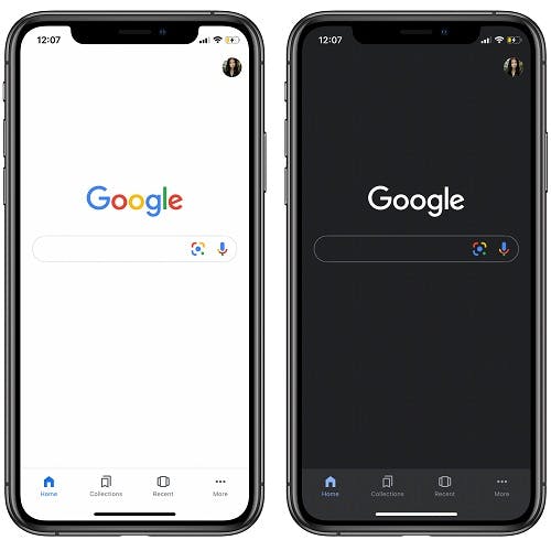
Benefits of Dark Mode:
Dark mode doesn’t only save your eyes from strain but it also saves your device’s energy consumption. Nowadays mobile phones and laptops which come with OLED screens, when put in dark mode they can save upto 60% battery as compared to when they are put in light mode, with a flat white background. But that’s not it, dark mode has as much aesthetic importance as it does with health and battery life, if not more. Let’s be honest, dark mode does look pretty amazing. It offers new and different ways of presenting graphic content such as graphs, pictures, photos and dashboards. It feels almost mysterious and innovative.
Dark mode makes colors pop and provides good contrast , other than that, studies have shown that there is a positive correlation between the user retention and dark mode, in the sense that applying dark mode puts less strain on the eyes at night and allows users to consume more content for longer periods of time.
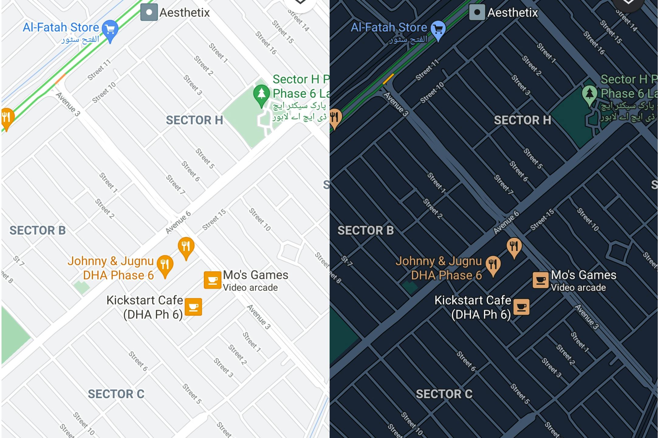
Due to the benefits of dark mode it does get a lot of positive popularity, which means that it is easy for one to be criticized for creating something that doesn’t actually require a dark mode. It should not be used in every application or website, for example when you are viewing a website in a well lit room or in broad daylight it is difficult to read text positioned on dark backgrounds. Some products such as Google maps has a feature that automatically switches between dark and light mode based on the lighting in a room, or based on sunset to sunrise.
Given that dark mode is still a new concept and even though a lot of companies including Apple and Google have adopted dark mode in almost all their user interfaces, it is still under development and it is very easy to mess things up if one doesn’t cater towards the nitty gritty details.
What to do & What Not to Do:
When faced with a variety of options it sometimes seems difficult to decide what to adopt and what not to, and to make things easier for you when designing for dark mode here are some of the things we’ve observed that you should avoid when designing for dark mode and what to do in these situations.
1. Avoid using Pure Black and White:
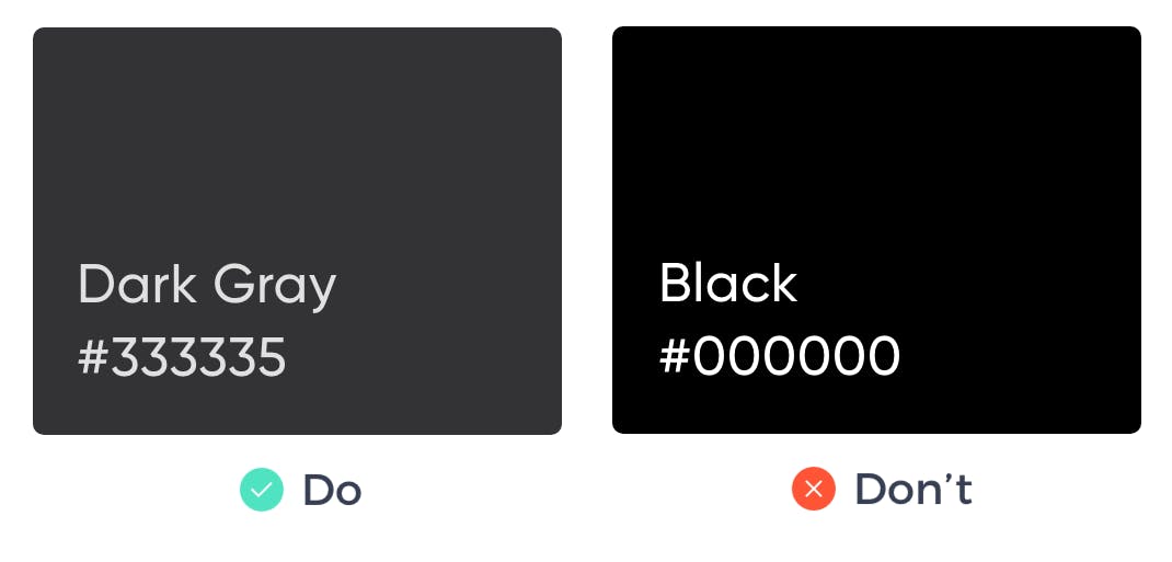
Remember when we said dark mode reduces the strain on the eyes? Yeah well if you use pure white text on a pure black background then that high contrast will be very painful to look at, hence not reducing strain on the eyes. In this situation it is safe to use dark grey rather than true black (#000000) as the primary background because light text on dark grey has less contrast than light text on pure black. The design should not be pure black and white but in shades of grey as well.
2. Avoid using Vivid Colors:
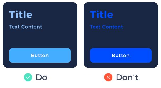
Vivid colors may look amazing on a white background but on a dark background they visually vibrate against the dark surface which makes them harder to read. You should use lighter shades of primary colors in the 50-200 range because they provide better readability on dark surfaces. It is important to ensure an appropriate contrast ratio between the content and the background (ideally 15.8:1) in order to avoid causing eye strain.
3. Avoid Shadows:
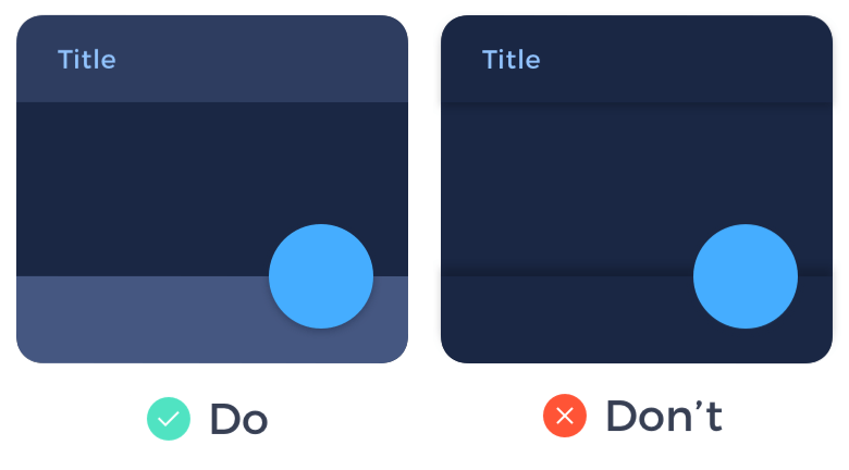
Shadows are a great way of presenting visual hierarchy in your design but only in light mode. When used in dark mode, even if the background isn't pure black, the shadow will look odd. Rather what you should use are elevation colors to present visual hierarchy on dark backgrounds and because of the brightness of elevation it builds a sense of depth, hence achieving the requirement of visual hierarchy in your design.
4. Let users Switch between Modes:
The worst thing you can do while designing a product is to take away control from your users, irrespective of whether you’re designing for dark mode or not. So for that matter it is important to provide a switch that allows users to switch between light and dark mode to ensure a good user experience. The user should always feel in control and should be able to opt for which mode they want to choose.

As a side note it would be extremely beneficial for you to give a look at the principles adopted by two of the 5 tech giants, Apple and Google. All major platforms from these companies include guidelines for dark mode, which, if you follow them, these principles will ensure that your design fits well in the ecosystem. You can find Apple and Google guidelines from the links below:
Conclusion:
One should thread carefully before walking on the “dark side”, because even though dark mode may seem elegant and stylish it has its fair share of consequences if not used correctly. By following these points mentioned above you can feel safe that your dark mode design will suit well with your customers needs.

