Others
01 September 2021
Mobile-first, Desktop-first and Responsive Web Design (RWD)

In the last blog, we discussed emerging design trends and the importance of staying up to date with design trends in order to expand your creative horizons. This blog revolves around the approaches to take in order to build a design for multiple screen sizes, as users today, prefer different devices for accessing the web according to their user profile and goals. As diverse user profiles prefer different devices for the same website, designers try to provide a consistent experience across those devices. The ultimate goal of a design across multiple devices is the consistency of experience.
Design experts define these key concepts that ensure Interusability for any cross-platform UX, for a coherent experience:
- Composition of functionality across those platforms
- Consistency of interfaces across these devices
- Continuity of content and data for possible transitions between platforms
During 2020, we saw a noticeable growth in mobile users visits on websites as 68.1% of all website visits consisted of mobile users. Statistica.com also conducted research on mobile users. According to their projection, by 2025 there will be 311 million mobile users in the US alone. Forget numbers, your average screen time on your phone and desktop while scrolling through web stores and apps sums up the story. People have started using their phones for accessing websites and actually reading content rather than doing the same on their laptops or desktops. What we’re trying to get at is that you can optimize your website for mobile use but usually at the expense of functionality or interactivity that affects the experience of your mobile users.

Before we dive into further discussion, here’s some phrases that you should know about:
- Progressive Advancement: An approach where a lower version is designed first with the most basic features and functions. We advance on to more complex versions for different devices (Desktops and tablets) adding interactions and features along the way.
- Graceful Degradation: A completely opposite approach where we start from the most “perfectly intended” version and gradually degrade according to compatible mobile versions by cutting down on interactivity and functionality.
- Responsive Web Design (RWD): The widely followed approach today where the design is flexible, responsive and can be rendered across different screen sizes.

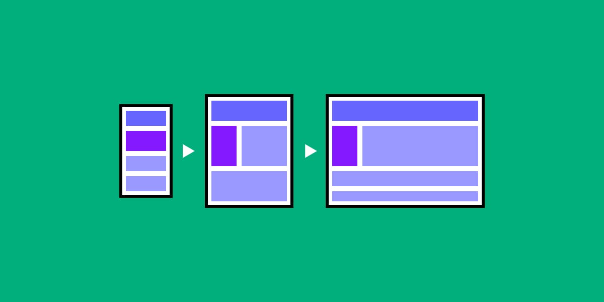
The mobile-first approach stems from the concept of progressive enhancement. The idea with this approach is doing the hardest part first. Hence, designing for other devices becomes easier. It comes down to the most essential features that the website, store or app can’t do without. The core concept is designing for a smaller screen to take care of your user needs without any constraints and then progressing to the bigger screens with more freedom. In simple words, mobile-first focuses on giving optimized views to mobile users followed by desktop users. On the contrary, the responsive design prioritizes desktop readers. Generally, it is easier to design a site that fits the content in a mobile device first as then it’s able to render across different screens.
The desktop-first approach can lead to the trouble of aligning the content and some last minute compromises on user experience for mobile users. Responsive web design and mobile-first design are not the same. A Responsive design is mobile friendly whereas mobile-first caters to the mobile users as a priority. Similarly, Desktop-first can be an approach in Responsive web design where your priority can be a Desktop design (like most cases in RWD)
Google’s Mobile-first Indexing
A couple years ago, Google started indexing and ranking websites by their mobile content. Historically, the content on desktop versions was used for indexing that greatly influenced the SEO and user query results on Google. Google's take on the move was that the majority of users are online on their mobile devices, hence their Googlebot primarily crawls the pages with their smartphone agent now.
Content and User
The mobile first approach usually prioritizes users resulting in the process being more content-centric. The smaller screen breakpoints allows the design to naturally fit around the corners. Moreover, the approach compels you to design multiple layouts based on different screen sizes and orientations. Although the approach can make you go the extra mile and make some extra effort, it also saves you the compromises in the desktop first approach where you are prone to the risk of “cutting down” on the experience.
Conclusion
In conclusion, it boils down to the user experience and objectives of the design for its audience. A good design is always built for the end-user, therefore, before you decide to follow an approach you must keep your end-user and their journey in mind. Your consideration should account for the screen size, device type and orientation that the end-users prefer. Moreover, your approach has to accommodate the audience and product/service. For example, if the majority of your end-users prefer desktop, you may decide to go with Desktop-first approach so your priority is catering to that audience first. Alternatively, if your end-user prefers mobile devices, your approach can be Mobile-first for the very same reason.
Hence, following the approach that’s most appropriate to cater to the experience and journey of the end-user seems like the way to go in order to get the results you’re looking for.

