Others
22 September 2021
Visual Tension in Design

Hello to all the fellow devs out there!
At TUK, we’re passionate about discussing ideas that translate into real-world solutions for devs everywhere. As someone who’s getting into the grind himself, I like to talk about my learning experiences and share what I have learned so far with the community out there. If you’re into web development and new technologies in the industry, we’re going to have a hell of a ride learning new things together.
Visual tension is a concept of manipulating the viewer’s cognitive discomfort by the arrangement of graphical elements. It is created by the manipulation of the relationship between design elements that deliberately causes a visual imbalance. It’s about capturing the viewer’s attention by creating a cognitive conflict. Visual tension is a key factor in establishing visual hierarchy, and consequently, the creation of visual hierarchy holds key importance in any design. Visual Hierarchy is utilized to arrange design elements in order to influence the order in which the viewer collects information. By using different principles of contrast, size, proximity, alignment, etc, designers arrange different elements in their “right place” to make important elements stand out from the rest. This blog revolves around the technique of tension in the graphical arrangement of elements in web design.
Tension in Graphic Design
In graphic design, tension has been a great asset for the designers to make the audience focus on elements while making them “uncomfortable” with an unusual arrangement of typography, framing, and design elements.

Another take on visual tension is the impression of the environment that causes cognitive discomfort for the viewer. For example, a glass of water at the edge of a table as compared to it being placed in the middle of the table causes more cognitive discomfort. The glass placed in the middle gives a more balanced image to the viewer.
Tension and Web Design

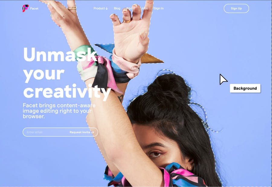
In web design, we see that certain graphics or design elements are arranged unconventionally to create visual tension in the layout. Although visual hierarchy has several principles to make elements stand out in a design, tension is applied in scenarios where the designers pick focus points and do things outside the bounds of design principles. The careful consideration in this technique is to go all out and to make the users identify those uncomforting spots where you want them to focus. In web design layouts, designers use visual hierarchy to create a hierarchy of importance for the users. With tension, they can create out-of-the-box experiences by playing with ideas outside the typical principles of design.

You can establish focus points for your viewers by using tension with different elements to make user experiences more hierarchically sound. The tension can help you to maintain the interest and focus of the user as well. Creating visual tension itself is a vast subject and involves many other techniques that we’ll discuss later on in another blog.
Conclusion
Visual tension is an interesting concept that has been around in arts and graphic design for quite some time now. Web designers can also use the concept to create focus points for their users by creating tension with respect to the importance of elements (CTAs, buttons, etc) and make user experiences more engaging. Just like any good thing, too much tension can result in the disorientation of the user’s focus. Hence, it’s vital to dive into any technique and its use before you implement it into a final web design. Experimentation with knowledge is the key to success here.

